


JOHNSONBURG CAMP & RETREAT CENTER IDENTITY
Johnsonburg Camp & Retreat Center is a Presbyterian Camp & Retreat center located in northern New Jersey. It has been providing outdoor ministry for over 60 years and was in search of a new logo to liven up and renew their brand to their audience.
Over the course of 2017, after months of partnership, we had come to thier new branding, representing their sacred place and open space.
INITIAL SKETCHING


Wanting a new and resh look, Johnsonburg Camp & Retreat Center looked towards a circle logo design to introduce to its audience. Though, as time passed and more discussion was made, this direction was deemed not to fit both the new and older demogrpahic which Johnsonburg has.
It was decided that a mix of the old with a new face was what they were looking for. A san-serif typeface leads for a new clean look, whilst a serifed complimentary typeface sticks to their roots.
LOGO
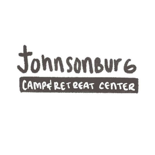
Johnsonburg Camp & Retreat Center wanted a logo that could work in it’s entierty or be used as an icon by itself easily enough to be recognized or reproduced by the campers who attend every summer.
The J represent’s the holy trinity and rifs off the Prebyterian seal, along with the leaf with the representation of nature and a flame. The J is like a shephards hook, gathering the poeple into the grounds and holding them safe.
LETTER HEAD & ENVELOPE


BUSSINESS CARDS
