


INTERTWINED: BRANDING

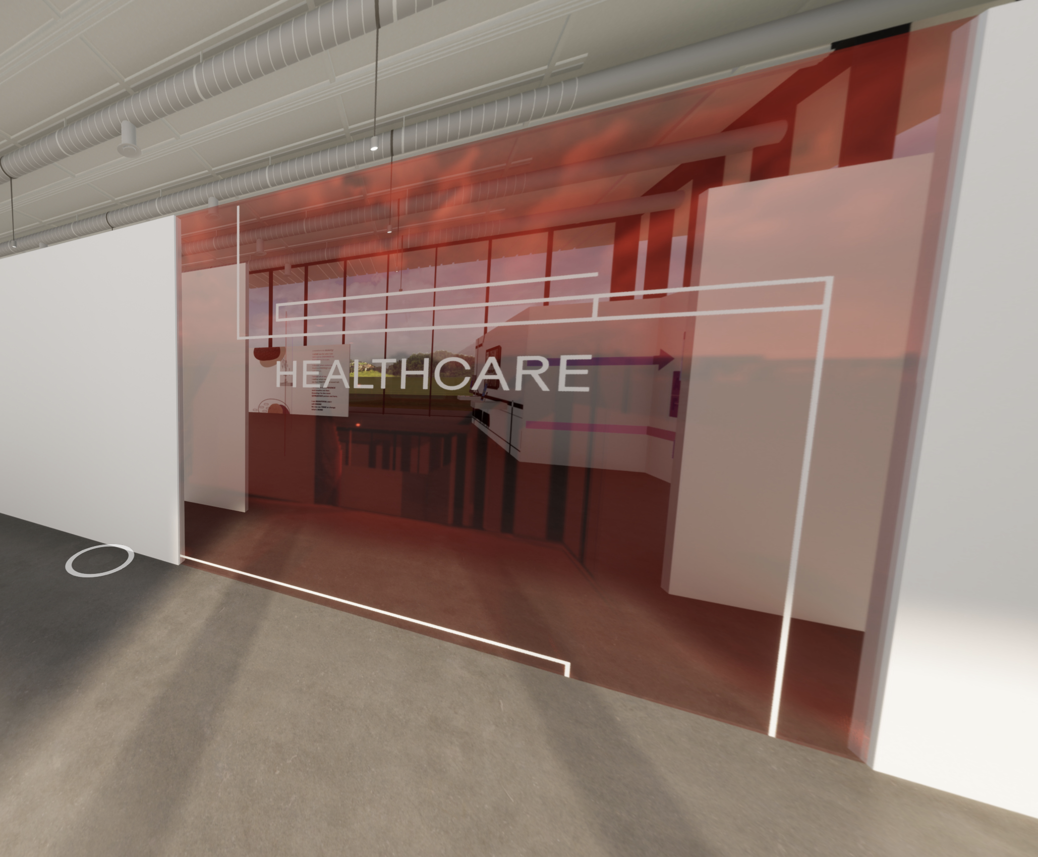
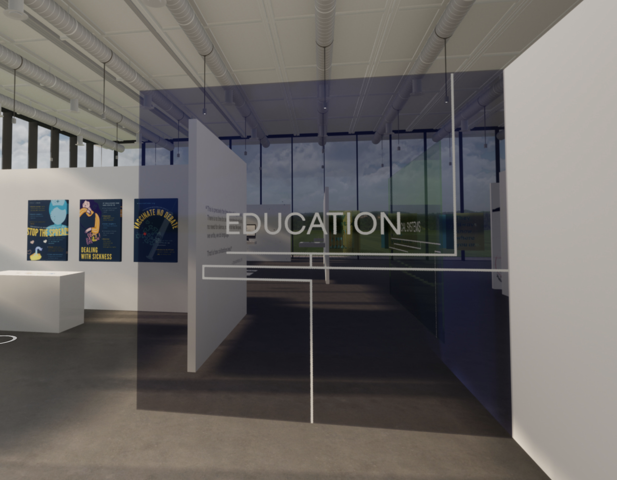
INTERTWINED: Designing Systems For The Future We Want. INTERTWINED includes seventeen transmedia capstone projects that individually examine systems of/& interdependency, reflecting on the events of 2020-2021, and examined through the lens of communication design. INTERTWINED seeks to present our commitment to the reform and advancement of existing systems. As designers entering the field, we dedicate ourselves to the development of work that better serves our communities.
Working alongside Assistant Professor Chantal Fischzang the branding for the 2021 Captsone Exhibition at Rutgers-Newark was created to highlight the interconnectedness and advancement of many systems.
The branding team will design a strong supporting identity system that encompasses the exhibition theme and can be applied to all exhibition collateral.
The branding team will design a strong supporting identity system that encompasses the exhibition theme and can be applied to all exhibition collateral.
LOGOMARK
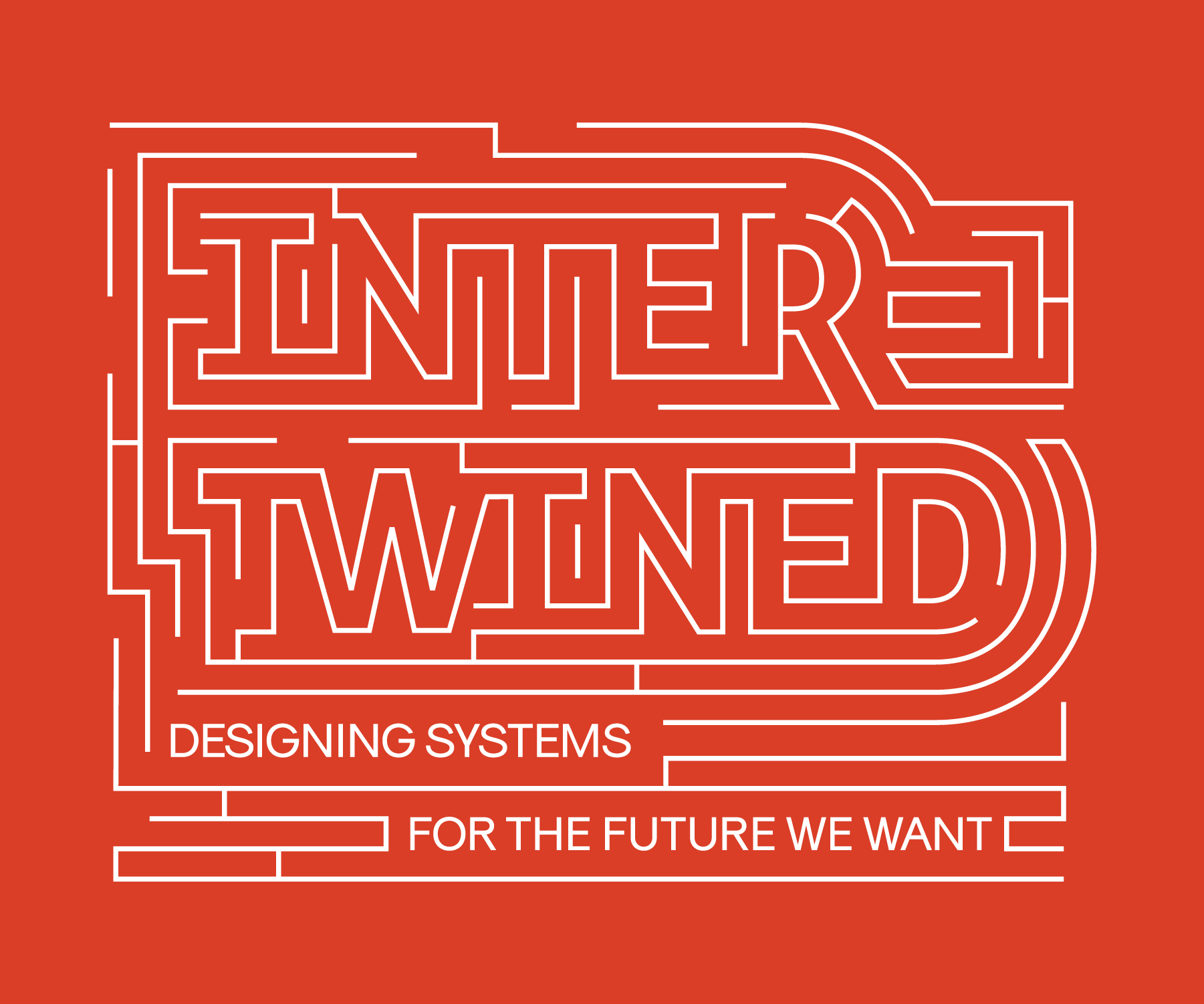


The logomark itself was inspired by mazes and how there are overlapping paths. There are many entries and exits to this maze, designed to amplify the idea of the interconnectedness of the many interdependant systems at work.
COLOR PALETTE


The color palette consists of both solids and gradients. Primaries of red and blue were used as an homage to the systems and foundation of color theory. Gradients used to showcase both the interconnectedness and system of color in use.
PATTERNS

Patterns were pulled from the logo itself and extended to create a useable system that would translate to multiple assets. These assets include: instagram posts, website header, signage, promotional pieces and more.