


BONFIRE

Bonfire Music & Camping festival is an event that was branded and created from the ground up. The goal of Bonfire is to provide a weekend of escapism, fun and fantasy through the lens of summer & summer camp. To do this, we want our marketing & design to match thus, we aim to create a cohesive brand for our festival that will entice and thrill our audience.
We want a brand that catches the eyes, is aesthetically pleasing, different and interactive. We are a music festival that combines both the traditional music festival whilst also incorperating the unique aspects of a summer camp. We want to express this look and feel though all of our marketing as well as tug at the past nuances of nostolgia associated with camping itself.
BROCHURE & POSTER


Our fold out brochure divided up the different aspects of the music festival and made sure to list all of the main attraction that were being offered. Sticking to the unifying color scheme, texture as well as use of imagery a unified design was created so goers could refer back to the brochure as they went baout the festival.
The poster, located on the back of the fold out brochure, acts as a take home piece & memerobelia for the festival itself. It evokes the sense of nostolgia through the color palette and carries this stained glass texture throughout the image.
MERCHANDISE
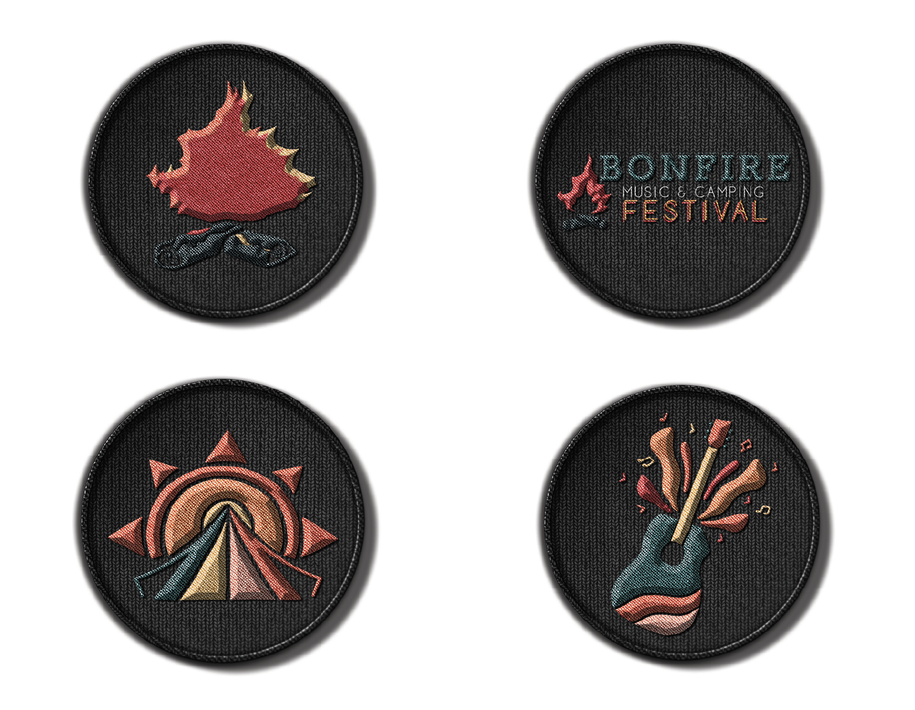

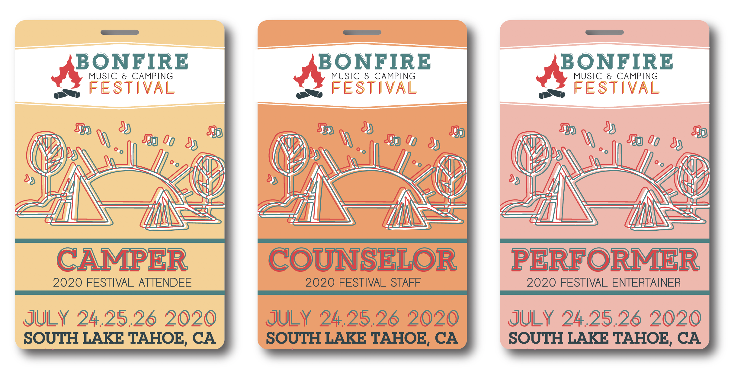

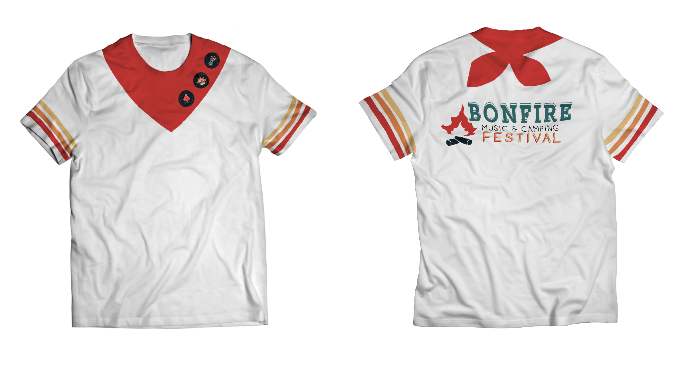
The merchandise for Bonfire follows the same rules and permeters set by the initial branding setup. Each item is custom curated to the events theme, to reall hone in on the idea of summer camp and this nostolgia of the attendees being a camper again.
Each item goes togehter as a set, to be cohesive and iconic in their design. They are to be a product that people want to purchace, collect and keep then return with the following summer to show their badge of honor for the following years festival!
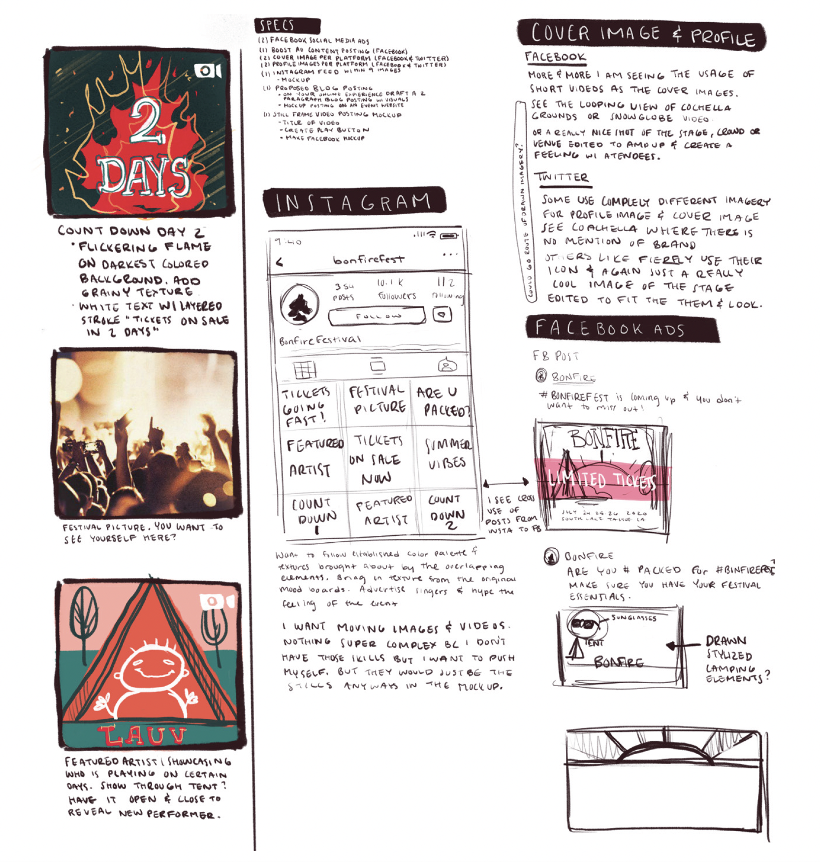
SOCIAL MEDIA CONCEPTS